

https://vimeo.com/manage/videos/693865804
KIAF emart X SSG.COM Media Art
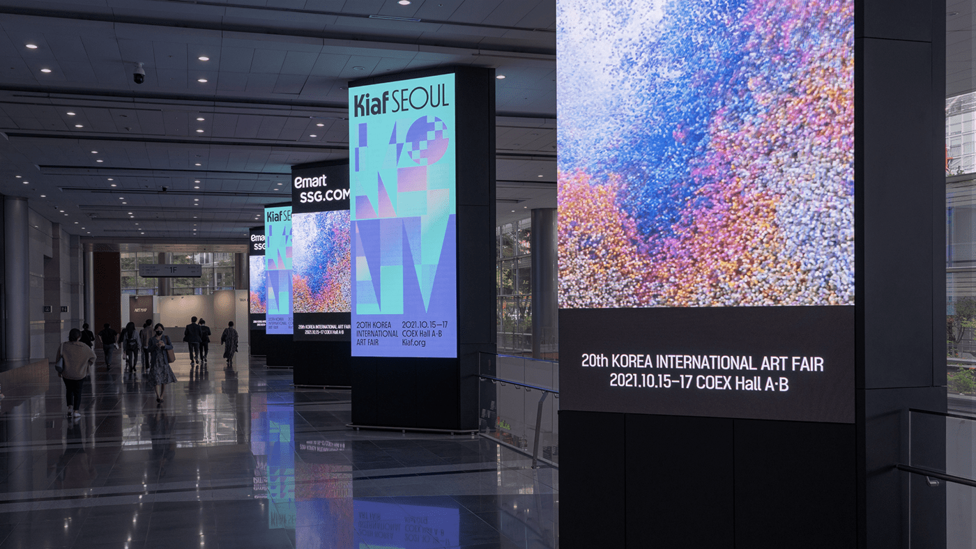
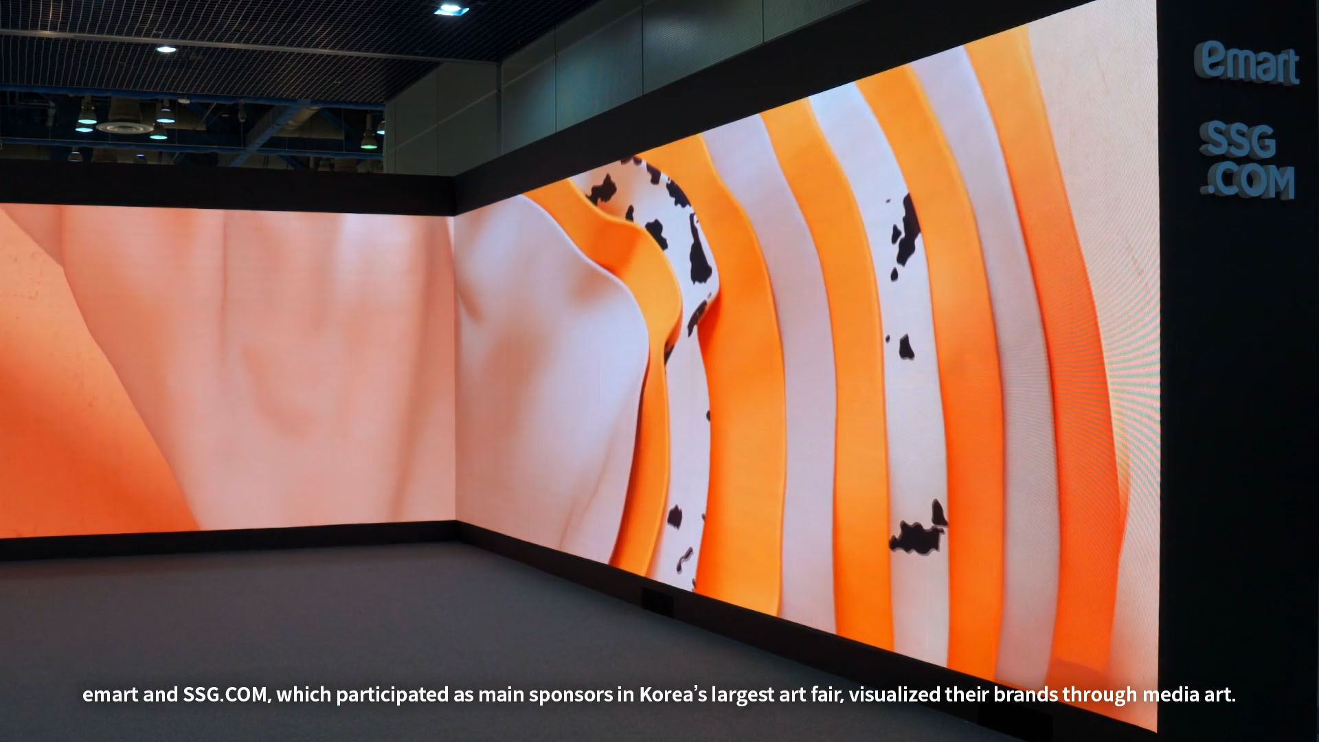
KIAF ART SEOUL attracts more than 60,000 domestic and foreign visitors and overseas collectors every year, and is the largest art fair in Korea where Seoul has established itself as a hub of Asian contemporary art. mmpx and KALLOS made a digital media art at KIAF ART SEOUL 2021, which opened in October 2021. emart and SSG.COM, which participated as main sponsors in Korea's largest art fair, visualized their brands through media art.
KIAF ART SEOUL은 연간 60,000명 이상의 국내외 전문가들과 전문 수입자들을 참관하는 한국에서 가장 큰 예술 전시회이며,
서울은 아시아 현대미술의 핵심 지점으로 자리 잡고 있습니다.
2021년 10월에 열린 KIAF ART SEOUL 2021에서 mmpx와 KALLOS가 디지털 미디어 아트를 전시했습니다.
주최자인 emart와 SSG.COM은 이 전시회에 주요 스폰서로 참가하며, 자신들의 브랜드를 미디어 아트를 통해 시각화했습니다.
Concept
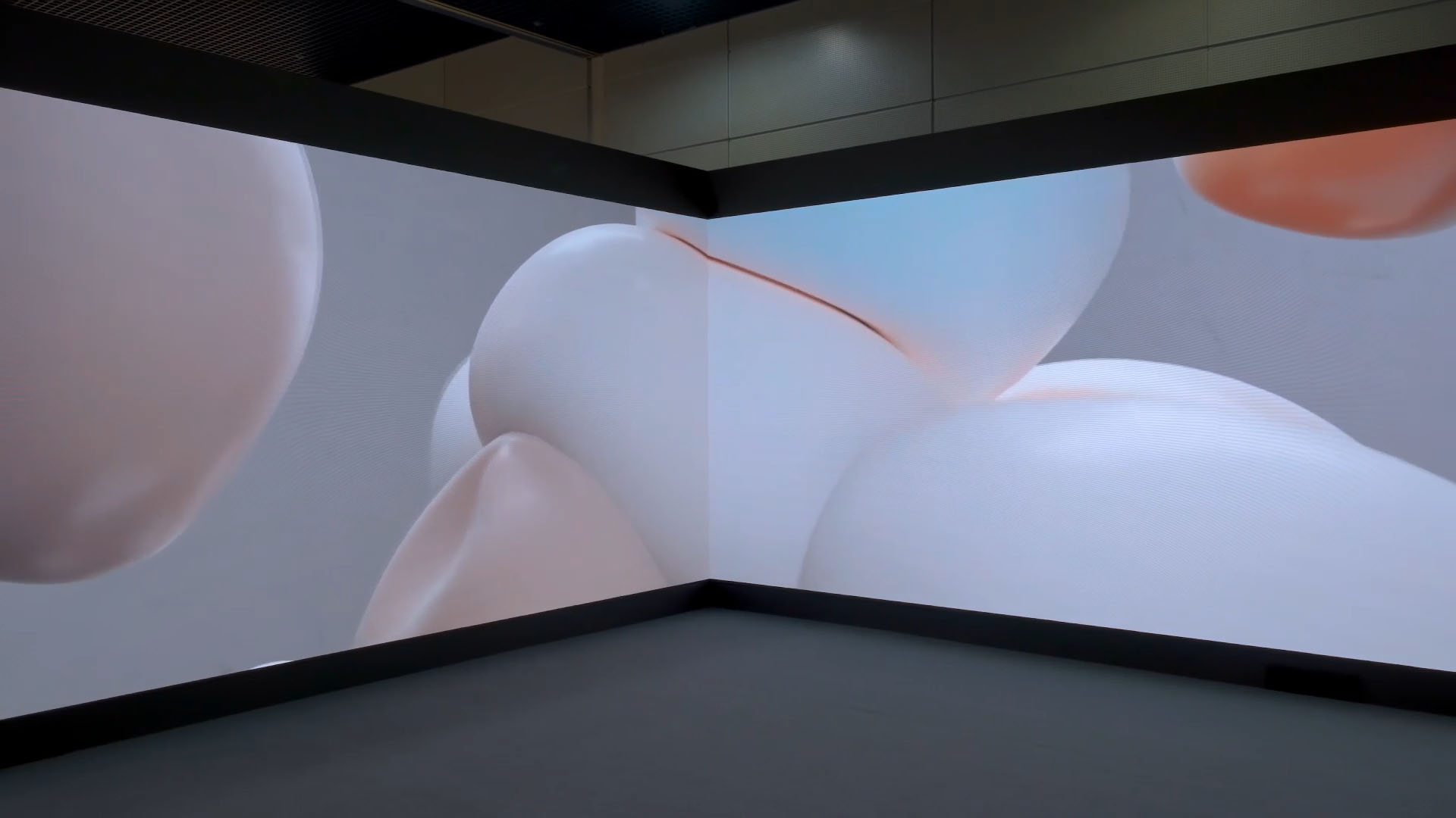
신선(新鮮)하다
Vegetables are fresh.
Fruits are fresh.
The keyword 'fresh' is a must-keep promise to customers made by emart and SSG.COM.
Together with the will to keep promises, it clearly communicates the brands’ actions the most of all.
In order to give a visual 'freshness' as well as the 'freshness' of food material, we worked in a new space so that visitors ca1n feel the freshness of the new visual and even the freshness itself.
야채는 신선하다.
과일은 신선하다.
"신선”이란 키워드는 emart와 SSG.COM의 고객분들을 위한 가장 중요한 약속입니다.
약속을 지키려는 의지이자 브랜드의 핵심을 가장 잘 전달하기 위한 키워드입니다.
전시회의 모든 방문객 및 아티스트들이 신선이라는 느낌을 시각적으로 받아들일 수 있게
새로운 공간과 새로운 오브제들을 구성하고 표현하였습니다.
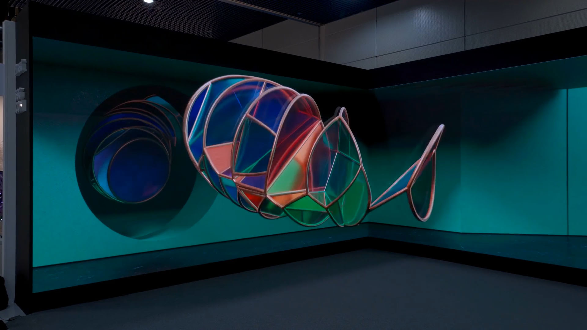
FRESH
We tried to put the efforts and pride of emart and SSG.COM for fresh food into the work.
It delivers the freshness of a new visual in a new space.
The 6 scene transitions that change as the lights turn on after the blackout show production areas
in the vibrant reality and NE.O in the spectacular future.
The objects swimming in the scenes represent six fresh food categories
(i.e. dairy products, meat, grains, vegetables, fruits, and fisheries), and they are symbolically expressed through
material textures.
emart와 SSG.COM의 신선식품을 위한 노력과 자부심을 작품에 녹여내려 했습니다.
장면에서 추상적으로 표현되는 오브제들은 유제품, 육류, 곡류, 야채, 과일, 수산물이라는 신선식품 카테고리 6가지를 의미하고 있으며,
시각화되는 모든 재료들의 특징을 잡아내어 추상적으로 표현하였습니다.
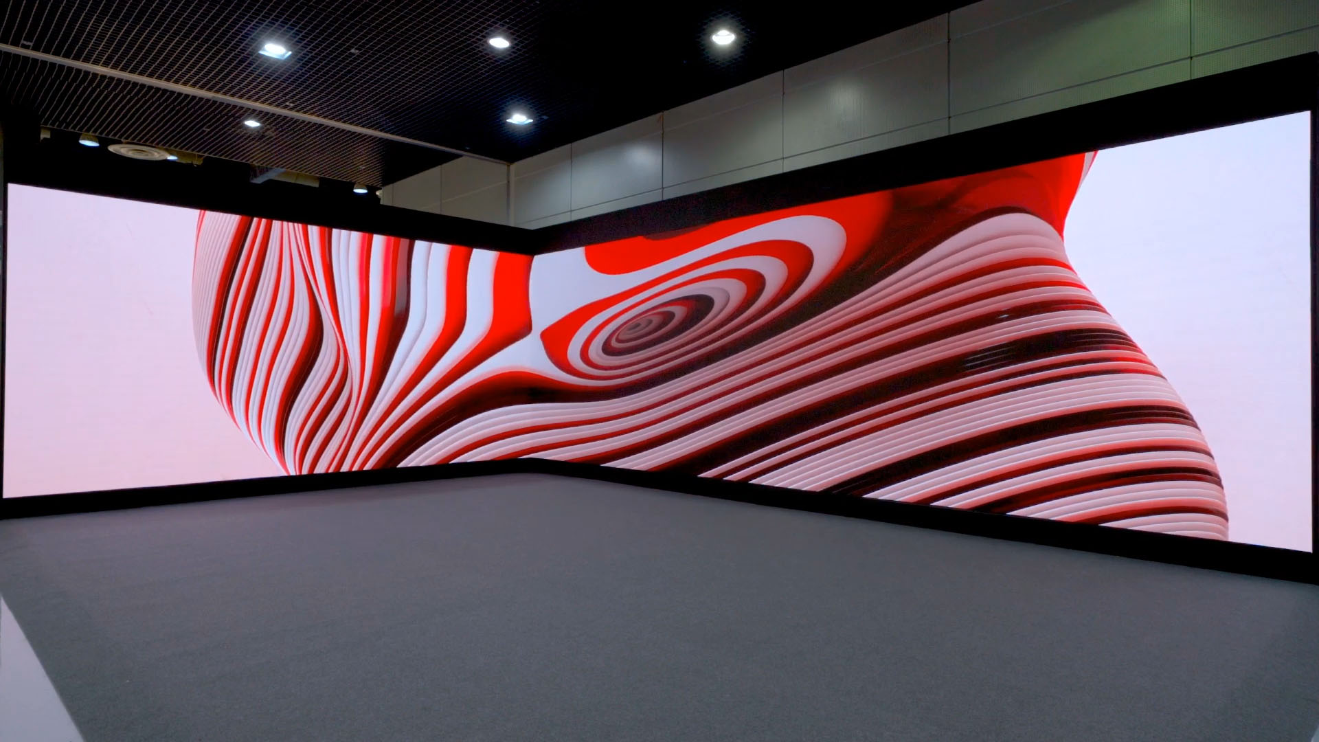
Visual Keywords : Deconstructivism / Reinterpretation / Organic
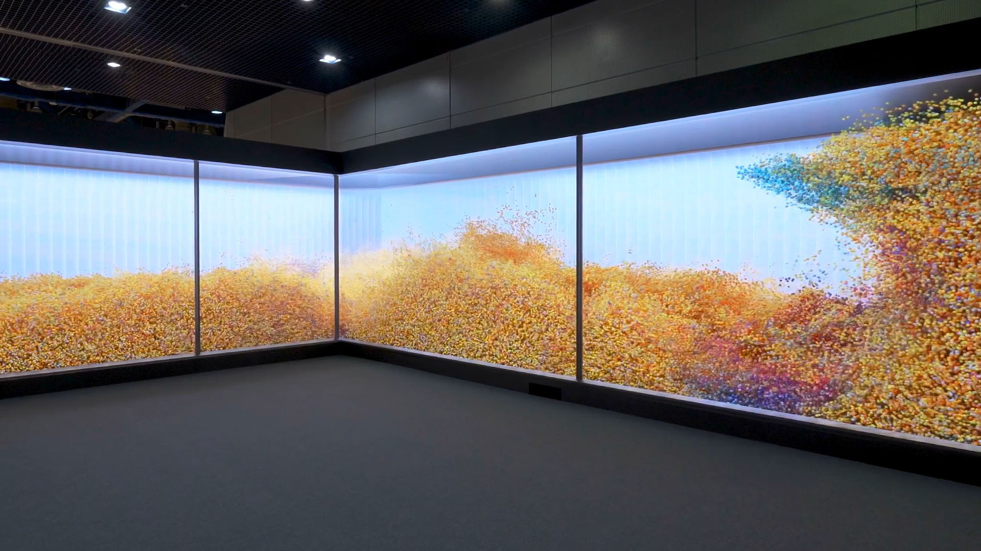
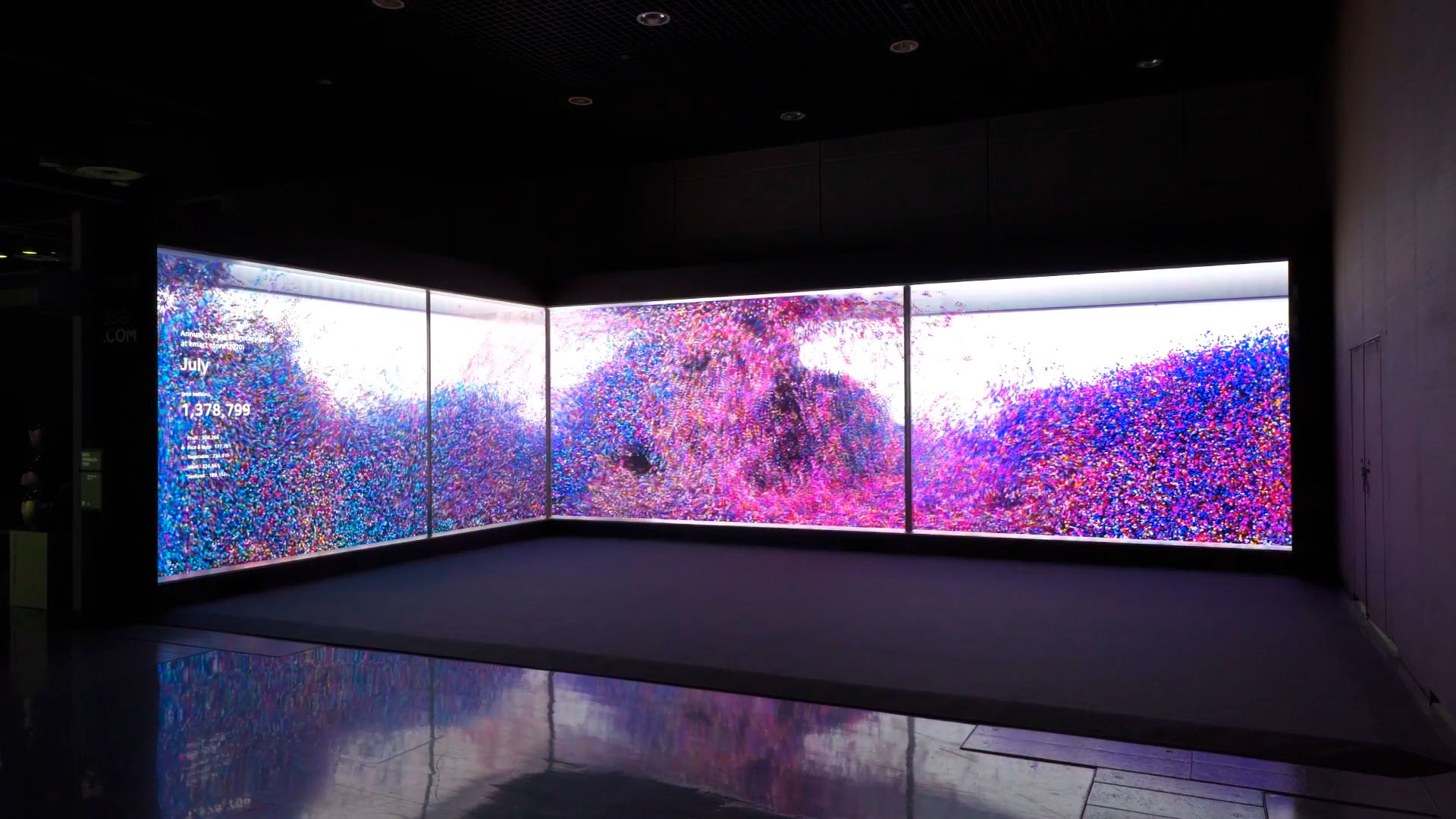
DATA WIND
DATA WIND is inspired by the movement of wind.
Through this work, we wanted to tell a story of the energy of e-mart's fresh food, that is, how much love it received
from customers in 2020.
We expressed the fresh foods of rice, vegetables, fruits, meat, and seafood through 5 colors.
As the number of fresh food purchases by customers using e-mart varies, the number of water droplets
in the waves increases and decreases, creating a soft wave shape.
The dynamic energy of each water droplet accumulates to form a huge wave, and the 5 colors mix with each
other and change 12 times per month to create colorful shapes.
DATA WIND은 바람의 움직임으로부터 영감을 얻었습니다.
우리는 이 작품을 통해 emart가 2020년에 고객들로부터 얼마나 많은 사랑을 받았는지를 이야기하고자 했습니다.
우리는 쌀, 채소, 과일, 고기, 수산물을 다섯가지의 컬러로 구분지었습니다.
고객들이 e-mart를 이용해서 신선식품을 구입한 건수가 달라지면, 파도 안의 물방울 수가 증가하거나 감소하여 부드러운 파도 모양을 생성합니다.
각 물방울의 에너지가 커지면서 거대한 파도를 이루게 되고, 5가지 색깔이 서로 섞여서 만들어지는 특정한 쉐입이 1년을 기준으로 총 12번 번경됩니다.
Visual Keywords : Particle / Wind / emart Color
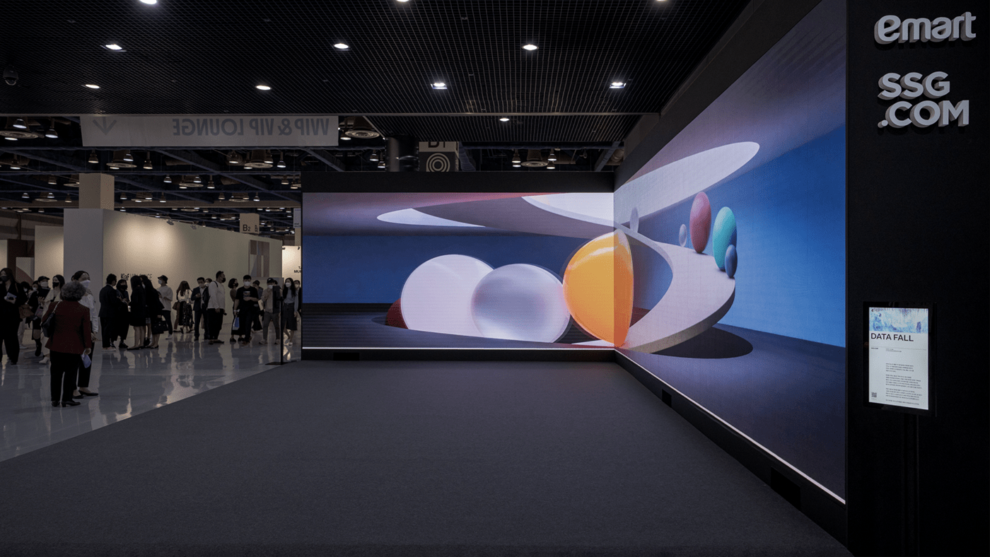
DATA FALL
DATA FALL is inspired by the movement of water stream. The shape of waterfall means the number of orders for
delivery that occurred on SSG.COM during 24 hours a day.
Through this work, we wanted to tell the story of SSG Delivery, which is leading the industry.
The colorful colors blended throughout the work symbolize the brand identity of SSG.COM.
At the same time, they are metaphors for the 11 categories that make up fresh food.
Water pours down as much as the orders get received, and it gradually begins to fill the space which makes
people feel cool just by looking at it.
A total of 8 waterfalls, once every 3 hours, accumulate, and when it reaches 24 hours, it is shaken by
a great force and quickly sucked out of the central ceiling gate as if freshly prepared food leaves for delivery.
DATA FALL은 물줄기의 움직임에서 영감을 받았습니다. 폭포수는 24시간 SSG.COM에서 발생한 배송 주문 건수를 의미합니다.
이번 작품을 통해 업계를 선도하고 있는 SSG택배의 이야기를 들려드리고자 했습니다.
작품 전반에 걸쳐 블렌딩된 다채로운 색상은 SSG.COM의 브랜드 아이덴티티를 상징합니다.
동시에 신선 식품을 구성하는 11가지 카테고리에 대한 은유적 표현이기도 합니다.
주문이 들어오는 만큼 쏟아지는 물은 점점 공간을 채워가며 보기만 해도 시원해집니다.
3시간에 한 번씩 총 8개의 폭포가 쌓이고 24시간이 되면 갓 지은 음식이 배달을 떠나듯
엄청난 힘에 흔들리며 중전의 상부 게이트를 향해
재빠르게 빨려 들어갑니다.
Visual Keywords : Particle / Waterfall / SSG Color
No Comments.